Showing posts with label graphic design. Show all posts

September 18, 2012

New Work: Staples Promotional Products 2012 Holiday Idea Book


It's that time of year... when retailers and those that market to the retail industry start plugging their holiday (Christmas) items. Which means I've been living in a holiday world for the past couple of months. I find this utterly delightful, I get to live the spirit of the season twice each year. You'll hear no complains in that regard from this lady!

I worked on the Art Direction and design for the holiday edition of our trend and idea starting book below. You can check out the 2012 Idea Book here. Again, I worked with the lovely Casey Dobbins as our awesome stylist, check out her new site for more visual candy.

March 6, 2012

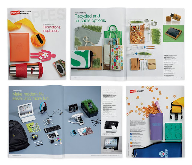
2012 Staples Promotional Products Idea Book

2012 Staples Promotional Products Idea Book - Work done while at Staples Promotional Products
I'm so excited to share this project with you, it's Staples Promotional Products 2012 Idea Book. This is a new marketing/design piece for 2012 that is meant to showcase some of the really fun and trendy promotional products out there. I was on the team that saw the project through from the beginning to end, from the project concept to product selection to the art direction at the photo shoot and final production. I also had a chance to work with the very talented stylist, Casey Dobbins, on this piece who knocked the styling out of the park. It was a really fun project to work on and I'm excited it's finally printed!


Here's the full version:

June 24, 2011

Unforked.

 As of Thursday noon, I had scraped the last bit of Smuckers natural peanut butter and strawberry jelly into a PBJ and there was officially nothing was left in my fridge that could combine to create any semblance of a meal. So eating-out was in order for my last couple of meals prior to moving.

Photo of "Cali" Taco and Chips by Stephanie Hertel

Today's lunch was a treat, something special. Sheridan's (Frozen Custard) opened a new concept restaurant called unforked close to work and a couple of co-workers and I decided to try it out today and ohmygosh it's good. Here's a snippet from their "about us" section:
We promise to buy clean, local, seasonal ingredients first; if not local, then family-farmed organic; if not organic, then fair trade; if not fair trade, then the most unique highest quality possible. We take responsibility for the food we serve while giving customers the flavors they crave.
The place is gorgeous. A designer's paradise. Eames chairs at every table, exposed steel beams, beautiful graphics galore: the cups, the parchment, the beverage labels, t-shirts, etc. Design porn, as I texted to my fellow-designer friend. The building was designed by 360 Architecture in KC and the branding and graphic design was done by Design Ranch. (side note: The KC Business Journal covered the opening, but why I ask is the architecture firm credited, but not the graphic design firm??? Did they not play just as big of role? Aren't they just as local? They designed this brand, this brand that will follow them to hopeful future openings nationally. Where's the equality, I ask? Sigh.)

Image via Design Ranch Blog 

This move may be dangerous, unforked is half-way between my new apartment and work. They're breakfast sounds sinfully delicious. I may become a regular, it's delectable, very well-priced and supports multiple local business. How could one go wrong?

December 7, 2010

Branding Quiz

Dear Blogger,
I'm sorry I've neglected you. I have 5 posts in the draft pile, just sitting there, waiting patiently to be polished, shined, and ready for posting. I pinky-promise if I get it together and finish my class project Thursday night I'll work on getting at least one of you up in the next couple of years months.


But for now... I came across this abstract branding quiz on FastCompany. I'm ashamed to admit my score, let's just say it was challenging in a good way. This is a great demonstration on how powerful color can be in branding.

March 21, 2010

Pinwheel Baby Shower


Almost one month ago we held a baby shower at work for one of my good friends, Megan, who is due any day (I'm constantly jumping at any noise my phone makes to see if her little cupcake is here). Her shower didn't have a theme per se, but it was one of my favorite to plan and coordinate.

Look at the cute, happy couple, they'll make an adorable baby!

We tried to follow an "on-a-stick" theme for the food with Dark Chocolate dipped cheesecake lollipops, cherry pie on a stick (made by a co-worker, how clever?), and cupcakes adorned with pinwheels, you can see our tiny wind farm in the background with all those pinwheel cupcakes.

Guests enjoying the food on a stick and our blue and green poofs.

Me, our guest of honor, and Lindsay, another host; all coordinated with the party colors! (surprise, surprise)

A card attendees filled out with their guesses for the birthday of baby boy Langford. I'm guessing they're little cupcake will arrive very soon...

November 22, 2009

Baby Tooth Chart


A friend and new mom is working on her son's baby book and was looking for a cute baby tooth chart, but couldn't find anything suitable. She asked me to design one for her to use. It's cute and functional and hopefully someone else can get some use out of it as well.

2.22.11 Update: Check out this link for a pdf (high-res) version! (Thanks for all of the lovely comments)

October 5, 2009

Wedding Invitations for friends!

I wanted to share some wedding invitations that I've been working on for friends. They're having a garden wedding next May and wanted a casual, fun look. I came up with four different options based on their color palette and wedding elements. I had so much fun working on these invitations, I can't wait to refine them even more and work on the rest of the wedding elements!

Option 1: Casual
Option 2: Trendy
(folded, no envelope)
Option 3: Formal
Option 4: Modern Citrus
(they may be using citrus fruits in their floral arrangements)

July 13, 2009

New(ish) Art 2 + Office Tour

Back in March, I got the "Keep Calm and Carry On Poster" from Blu Lima on Etsy. I was buying another color for a friend's birthday and thought I deserved one for myself and it's appropriate to have in the workplace. Don't you think?
I figured I'd take a couple extra photos and give you a tour of my booth at Hallmark:

Here are some of my favorites from the photo:
-Iowa landscape in pastels by Diane Kunzler, my high school art teacher, one of my most treasured pieces of original art.
-Vintage lime green turtle given to me by my co-worker, it is after-all my namesake.
-Mosaic frame and pitcher made in a Hallmark mosaic workshop during my summer internship.
-Laser-cut "Thanks," "Bananas," and wine bottle, all from co-workers... we like to use the laser cutter!

-Limited Quantity "What Up Homies" letterpress print from the one-and-only, Jessie Snede.
-Another piece from the intern mosaic workshop.

July 2, 2009

New(ish) Art

I finally got around to framing (and posting) some artwork that I got in March & April. Here's the first set of two letterpress prints that I got at a First Friday event at Hammerpress. Aren't they lovely? And they're the perfect colors for me! I love Hammerpress' artwork and style, but I have a hard time finding posters where I like the band and the design, so these little characters are perfect for me!
I hung them on the small wall when you first enter my room, so every time I walk in I'm greeted by these lovelies!

June 18, 2009

Jae's Bridal Shower


Speaking of weddings... we had a bridal shower for one of my co-workers on Wednesday to celebrate her up-coming union. This may have been my favorite shower so far! Jae made it easy on us and had originally created two color palettes for her wedding; one with soft pinks & golds, the other with pinks & greens. She decided to use the pink & gold for her wedding and we used the pink & green palette for the shower! Jae had also originally intended on using a bird motif in her wedding, but wasn't able to, so we picked up that theme and I created some "Love Birds" for her shower.

Above the beautiful bride with her traditional bridal shower bow bouquet to use during her rehearsal, the delicious party spread, flower decorations Dayle and I made, and the gift table with the laser-cut bird & heart strings. So pretty in pink!

February 17, 2009

'Lil Monkey Baby Shower

Images on mood-board are from Martha Stewart, Amy Atlas, and Paul Frank.

This past week we had a Banana Split baby shower to celebrate the anticipated arrival of a co-worker's baby boy. She's decorating the baby's room in a monkey-theme, so we thought a banana-split party was appropriate. I've held off on posting the mood board and other images, to keep the shower as much of a surprise as possible. The shower turned out perfect and went off without a hitch... more images from the actual shower to come soon!

The soon-to-be parents are keeping the name of the baby a big secret, so we played a guessing game with the shower attendees. We handed out cards to guess the name, date, weight, and *length of the baby.
*I put height on the actual card, but learned during the shower that this is typically known as length for babies... leave it to a non-parent to make the cards!

January 13, 2009

My Grocery List


Lame? Check.
Obsessive? Check.
Efficient? Check!

Last night I created a grocery list template to print and check-the-box on what items I need for that week. I first got the idea from my parents, who had borrowed the idea from one of our family friends. I made fun of them to the end at how meticulous and lame they were, but a couple days later I was begging them to e-mail me their list so I could do the same thing!
I finally got around to making my own after I had created three grocery lists for this week alone, hopefully it will make me a little bit more efficient and only use one master list. The list is tailored to what I typically buy (notice all of the beans in the canned vegetables section... mmmm...) and the items are listed in the order they are merchandised in the grocery store.

This is such a clever idea, I think everyone should have one! (and it's fun to check the box!)

November 4, 2008

Check it out!


So... I just read that air conditioned [design] designed the American Love it or Fix it Poster... if you thought their poster was designed well, check out their website. Holy programming! This may be the most unique and best portfolio sites I've seen! It's a little hard to navigate, if you don't want to spend a lot of time making clicks, but it definitely makes up for it in the cool-factor. There are a couple different transitional elements to scroll through the project photos and once you view a project, the icon representing it turns grey. How clever?

September 18, 2008

HomeGrown

Image of RushWade Studio

Last night I attended AIGA KC event series: HomeGrown. "Our fair city now offers the 6th largest concentration of visual artists and the 3rd largest population of architects in the nation. AIGA KC celebrates and embraces this thriving creative community by inviting diverse "homegrown" talent to share their hard-earned stories of success."

Fresher than Fresh traveling snowcone mobile

Last night featured dialogue between Brady Vest of Hammerpress and Ingred Sidie and Michelle Sonderegger of Design Ranch at RushWade Photography. There was also a "snowcone reception" by Fresher than Fresh before the event. I didn't get a snowcone, but I'm really regretting it today, because my favorite blog, Design*Sponge, did an interview with Lindsay Laricks today!

I also bought this poster featuring the event for five-dollah!

September 7, 2008

Spoonflower

I have been thinking about printing my own fabric for a couple of weeks now, either by screen-printing or some other method. Recently I found a Japanese designer on Etsy doing the same thing, under the name Kalla Design. All of her items are unique to her, which I think is really awesome. Apparently some other women were also frustrated with using the same fabric as other crafters for their own projects and started a company called Spoonflower, with their husbands.
How exciting? Spoonflower is currently in a beta version and inviting members to join. The logo caught my eye because it looks pretty similar to packaging design project I worked on while in college...

August 4, 2008

Hey, Knit Happens

I thought this was super-cute and wanted to share, I was tagged at work recently with this cute orange and green phone “sweater.” And look, it matches my July wallpaper (from ImageHaus) perfectly! Thanks to the ladies of Knit Happens for thinking of me!

May 7, 2008

De-branding?

Wow! I just heard about debrandedhome.com on design*sponge today. It's basically talking about "debranding" your home and buying these cute labels to put on glass or plastic bottles for your consumables, basically creating a brand in itself.
This idea completely blew me out of the water... especially for someone who is so into brand management marketing & design. My mind is swirling with all sorts of ideas and the impacts this could have on creating a de-branded or no-name brand... or lack there of. Of course the idea is deeper than product driven, but it just gets you thinking!

March 20, 2008

Freelance Mania... or should I say pro bono mania...

Last night I got a call from a family friend to present concepts on the RAGBRAI (Register's Annual Great Bicycle Race Across Iowa) campaign for Jefferson, which is an overnight town on the race this year. I am really excited about the possibilities of this campaign, but also really nervous. I got the call on Wednesday night and I need to have concepts ready by Sunday! We are in the rough concept sketch phase, but being the over-achiever I am, I want to present more finished campaigns. I have some decent ideas, but I am finding it hard to get motivated to work on (thus me blogging!). I am working on concepting for so many campaigns right now it is a bit draining.
I was very honored to be asked to present concepts for Jefferson's RAGBRAI events. Jacque (the family friend) has also asked the two art teachers I had from elementary through high school. It's so crazy being considered on the same level as the people who started me on the very basics of art and design in my younger years! I would love to collaborate with both of my former teachers!


I am also working on Jefferson's annual Bell Tower Festival campaign, which has proven a bit more challenging in different ways than I had originally imagined. I am extremely excited to be able to help Jefferson out and (hopefully) give them a strong campaign that will create a more concise and fun image for the festival.


The Bell Tower Festival campaign is all revolving around a spray-painted look. We will use spray-paint to create the posters (above is a rough preliminary version) and stencils and spray chalk on the streets before and during the festival. The spray chalk should wash away in about 10 days. Using spray chalk would also be a really cool solution for RAGBRAI... but I don't want to be known as a one-trick pony. Because I am working on both campaigns, I am really trying to keep them unique and specific to their own needs.


I am also working on a friend's (Stephanie) wedding invitations (above are preliminary ideas). To give Stephanie & Beau the wedding invitations they deserve, I am giving them all of the design work as a wedding gift and we will make the invitations ourselves. Stephanie's colors are olive green, black, and silver as accents; she is also thinking of using decorative branches in some of the flower arrangements, hence the branch imagery in the initial invites ideas.

Whew! Thinking about all of that, on top of all of the extra projects I want to get done at my day job, I am feeling a bit overwhelmed. I better get to work on something...